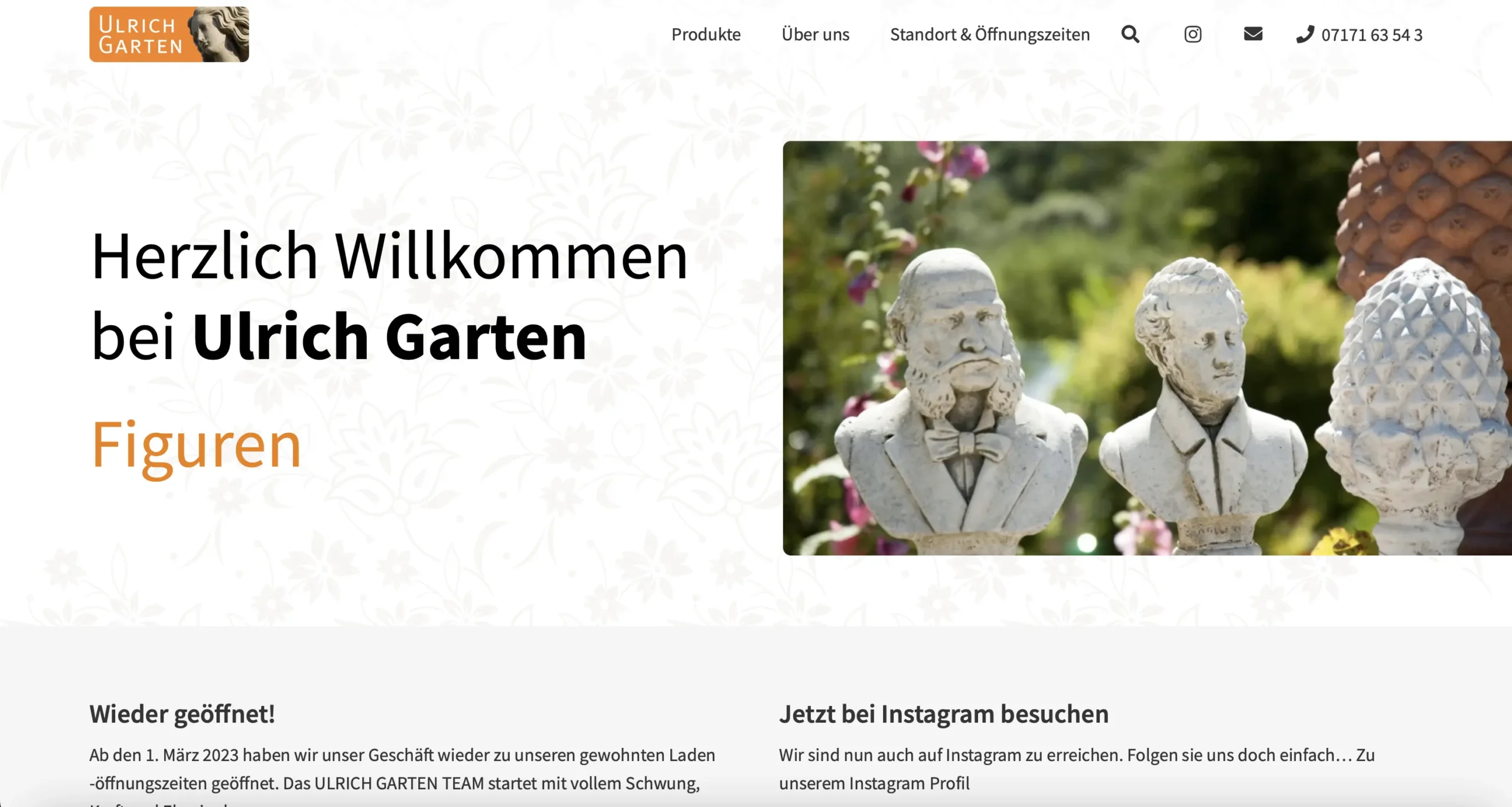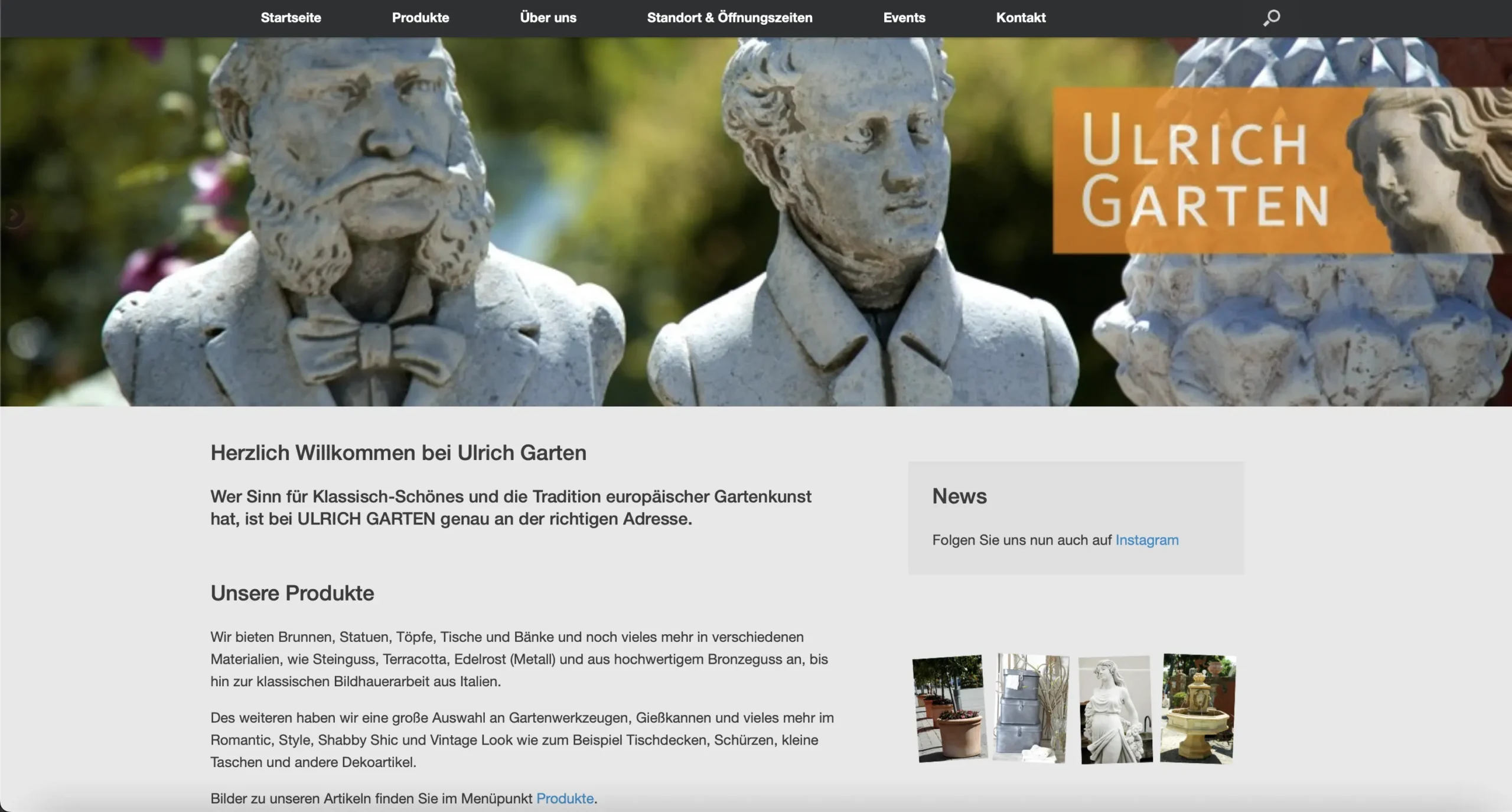
I recently had the opportunity to redesign a WordPress website for one of my clients. The website was outdated, had poor navigation, and was difficult to use.
Before and after the redesign
My first step was to analyze the client’s requirements and identify their goals for the website. Then, I created a wireframe and a prototype of the new design. I focused on improving the user experience by simplifying the navigation, making it easier to find information and adding more visual elements.
To make the website more user-friendly, I added new features like a search bar, a contact form, and social media icons. I also optimized the website for speed and performance, which improved its loading times.
To give the website a more modern and professional look, I chose a color palette that matched the client’s branding and added custom graphics and images.

